Mellat Bank
Redesigning the Bank Mellat application has the potential to significantly improve user interface and experience, enabling users to interact with the application and its banking services more efficiently and effortlessly. The focus of the redesign would be on enhancing the overall usability and accessibility of the app, making it more intuitive and user-friendly.
The problem:
1. Complex and confusing user experience
2. Outdated user interface
3. Limited customization options
4. Insufficient user support
The goal:
The purpose of redesigning an app is to provide a user-centered experience that caters to the diverse needs of different user segments. This involves streamlining the user experience, updating the interface, providing more customization options, and increasing the availability of features to meet the varying requirements of different user groups.
My role:
My aim as a UI/UX designer was to simplify and improve the user interface, making it more user-friendly and intuitive.
My responsibilities:
My responsibilities as a UI/UX designer included analyzing user needs, conducting research, creating wireframes & prototypes, designing interfaces, & incorporating feedback to enhance usability & aesthetics.
User research: summary
During the user research phase, I gathered valuable feedback from participants about their experiences with our app. They shared their opinions and feedback on various aspects, including the challenges they faced while performing activities like money transfers and other banking transactions.
The feedback I received from the participants highlighted specific pain points and areas that needed improvement. Common themes included difficulties in navigating the app, confusion with terminology or instructions, cumbersome workflows, and frustration with certain features or functionalities.
Additionally, participants expressed their desire for a more intuitive and user-friendly interface, streamlined processes for banking tasks, clearer instructions and guidance, and enhanced overall usability.
This detailed feedback played a crucial role in shaping the subsequent design and development process. It helped us to prioritize and address the identified pain points, improve user flows, refine the interface, and create a more seamless and satisfying user experience for performing banking transactions within the application.
User research: pain points
Based on user feedback, I have identified several areas for improvement in our app. These include:
1. Navigation difficulties: Some users experienced difficulty finding specific pages and features within the app.
2. Inability to quickly perform a specific task and lack of personalization: Some participants found it challenging to efficiently complete certain tasks and expressed a desire for more personalized experiences.
3. Complex user flows: Performing banking tasks, such as money transfers, proved to be complicated and time-consuming for some users.
4. Unclear or ambiguous functionality: Certain features or functionalities in the app were unclear or ambiguous to users.
Persona
Name: Sarah Thompson
Age: 30
Occupation: Marketing Manager
Goals:
Quickly and easily perform banking transactions.
Stay updated on her account balances and transaction history.
Manage and monitor her expenses effectively.
Customize the app to prioritize her most frequently used features.
Challenges:
Navigation difficulties: Sarah often struggles to find specific features or pages within the app, leading to frustration and wasting time.
Complex workflows: She finds certain banking tasks, such as setting up recurring payments or linking multiple accounts, confusing and time-consuming.
Lack of personalization: Sarah desires a more tailored experience that allows her to place her most frequently used features front and center.
Expectations and Needs:
Intuitive interface: Sarah expects a user-friendly app that allows her to navigate effortlessly and find the desired features without any confusion.
Streamlined processes: She wants to be able to perform banking tasks efficiently, with clear instructions and minimal steps.
Customization options: Sarah would appreciate the ability to personalize the app's home screen to prioritize her most frequently used features.
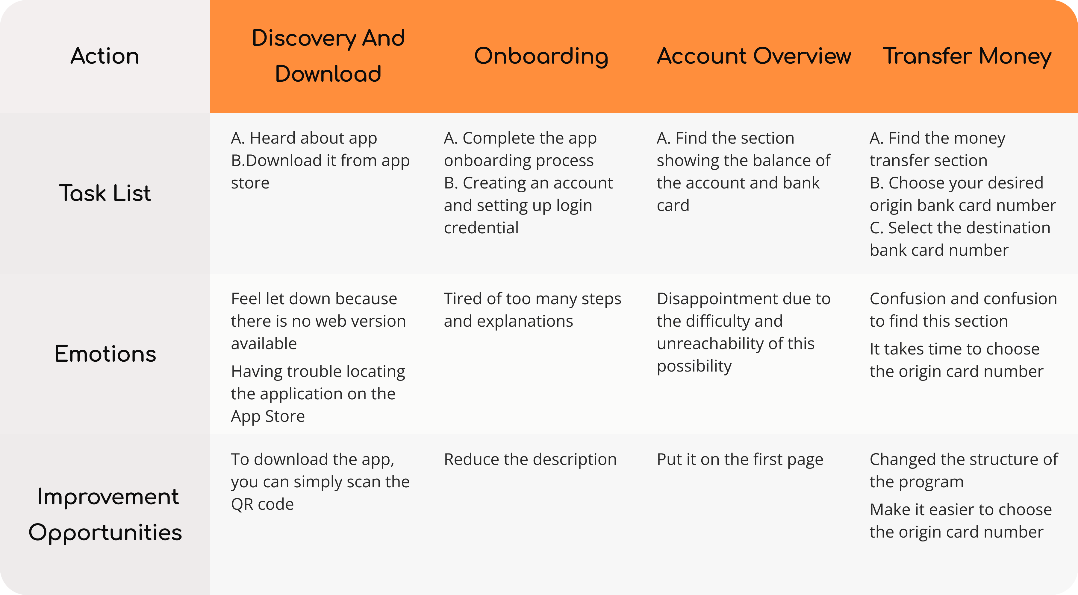
User journey map
Persona: Sarah Thompson
Goal: Sara can easily transfer money to her friend using the banking app.
Paper wireframes
Once the data was collected, the next step was to create paper wireframes for various screens based on initial ideas. These wireframes were analyzed to determine which elements could be included in the digital wireframes and how they could address the pain points of the users.

Digital wireframes
As the initial design phase continued, I made sure to base screen designs on feedback and findings from user research.
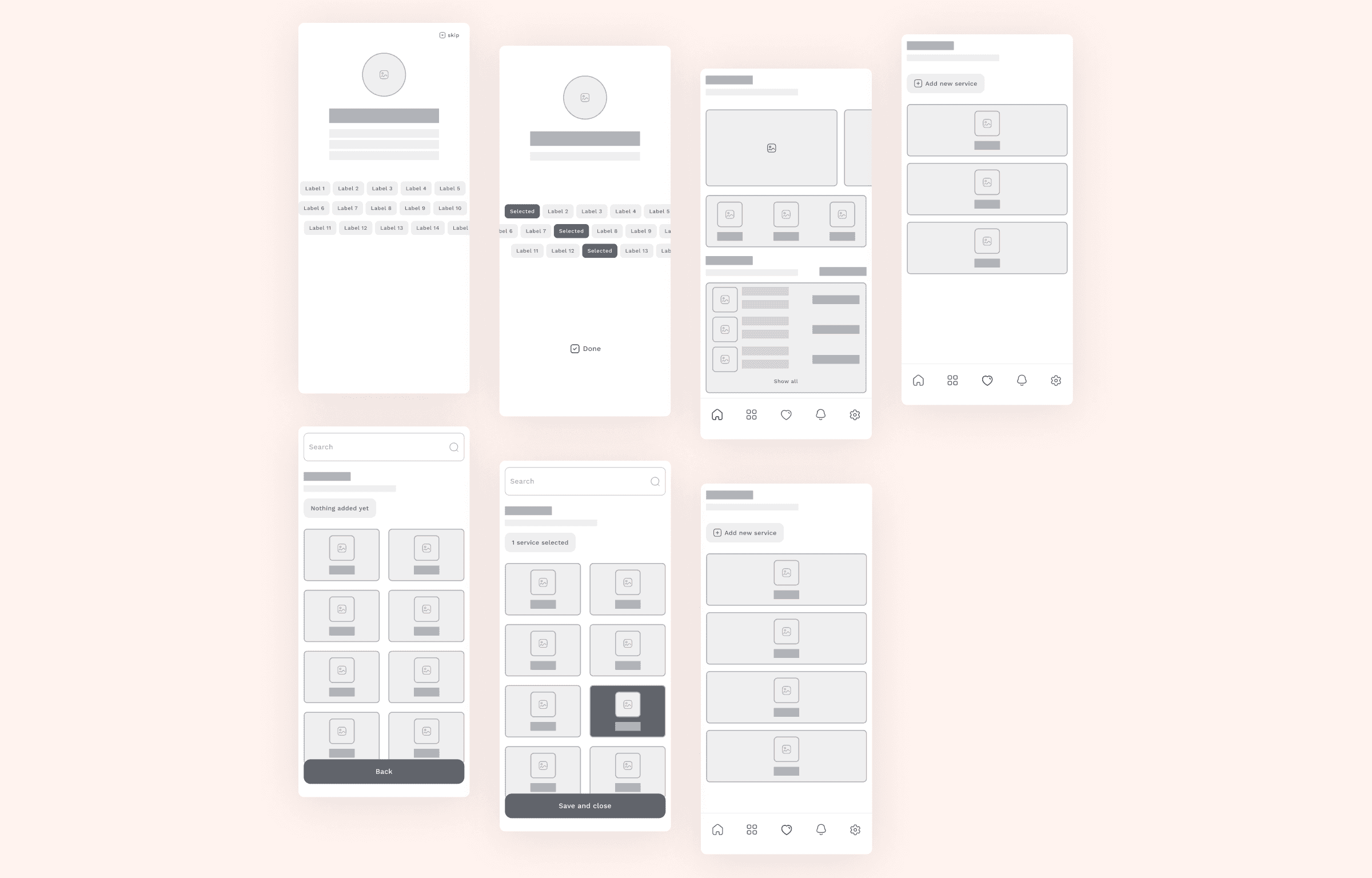
Low-fidelity prototype
The low-fidelity prototype demonstrated how to add new services after completing the intro.
Usability study: findings
To improve the app's usability, I conducted a test with three participants. Each participant was given a set of prompts to provide feedback on.
If the user selects some sections but doesn't want to save them and wants to close them, it can be difficult for them to skip the intro.
If the user selects some services but doesn't want to save them and wants to cancel them, it can be hard for them to go back to the list of favorites.
The user may be unable to tell if new services have been added. A message should be displayed after a new service is added to address this.
Users would like a search option on the main page to find their required services easily.
Users would appreciate the option to enable or disable certain sections of the main page.
Mockups
Some participants in the usability study expressed their desire to use their phone numbers to log in to the app. As a result, the goal was to design a screen that would allow users to log in with their username and password, as well as provide the option to log in using their phone number.
Participants expressed interest in adding new sections to the main page, such as bills, exchange rates, and locating the nearest ATM.
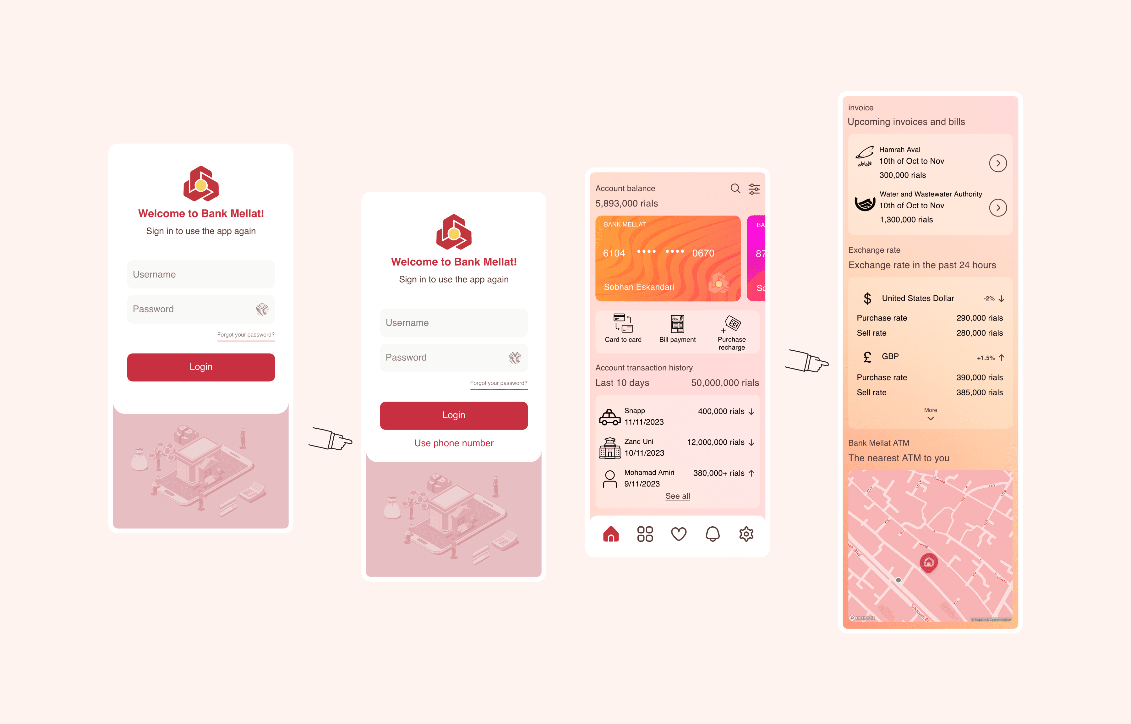
High-fidelity prototype
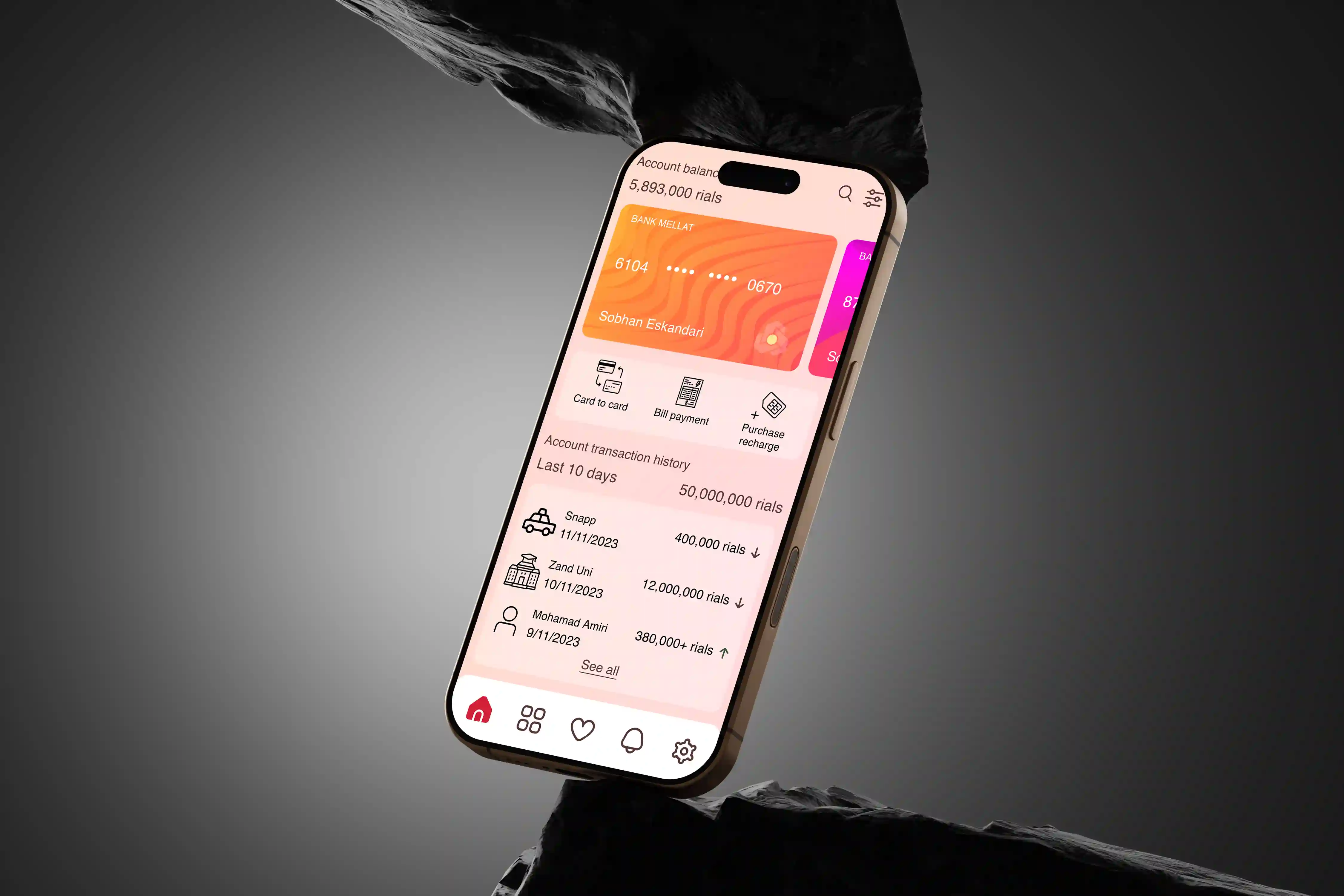
The final high-fidelity prototype presented cleaner user flows for selecting services during onboarding and customizing the homepage. Additionally, users can now add new services to their favorite list, making it easier to access them.
Accessibility considerations
Users can easily search for services and topics without navigating through the entire app.
Users can personalize the application according to their preferences.
Instead of manually entering information, users can easily scan cards or bills.
Impact
The application assists users in achieving their objectives and enhancing their overall experience.
What I learned
During the process of designing the app, I learned that the initial ideas are just a starting point. Iterations and refinements are made based on brainstorming, usability studies, and user feedback. It is crucial to pay attention to every detail and create a design that ensures the best possible user experience. Moreover, analyzing user reviews on the App Store or Google Play can provide valuable insights into users' problems and viewpoints, allowing designers to better address their needs.
Next steps
It is important to conduct another round of usability studies to validate whether the issues that users faced have been effectively addressed. Additionally, the app should be refined and improved based on the feedback and insights obtained from Hi-fi usability tests and usability studies. Furthermore, conducting further user research can help to identify any new areas of need that require attention.
One thing needs to be mentioned:
A high-fidelity prototype in Persian language version
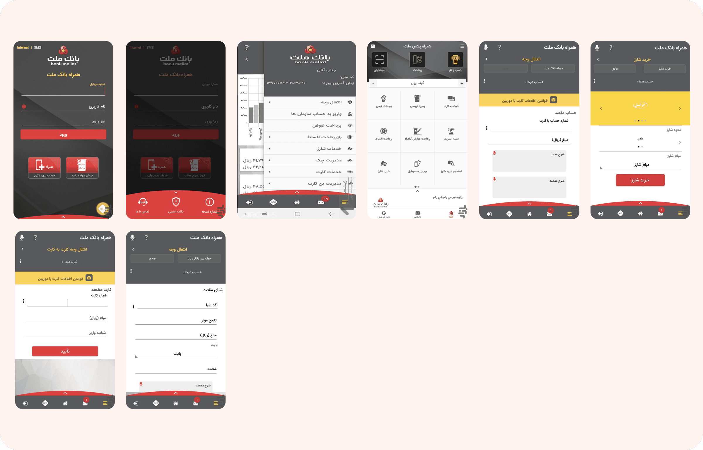
Offical app
These are Official Screenshots from the Mellat Bank App.