MyPIL
MyPIL, Is an innovative solution that allows users to store all their digital information in one place—a digital card (a web page). As the product designer and branding specialist, I have carefully crafted MyPIL to provide a seamless user experience while reflecting a cohesive and visually appealing brand identity.
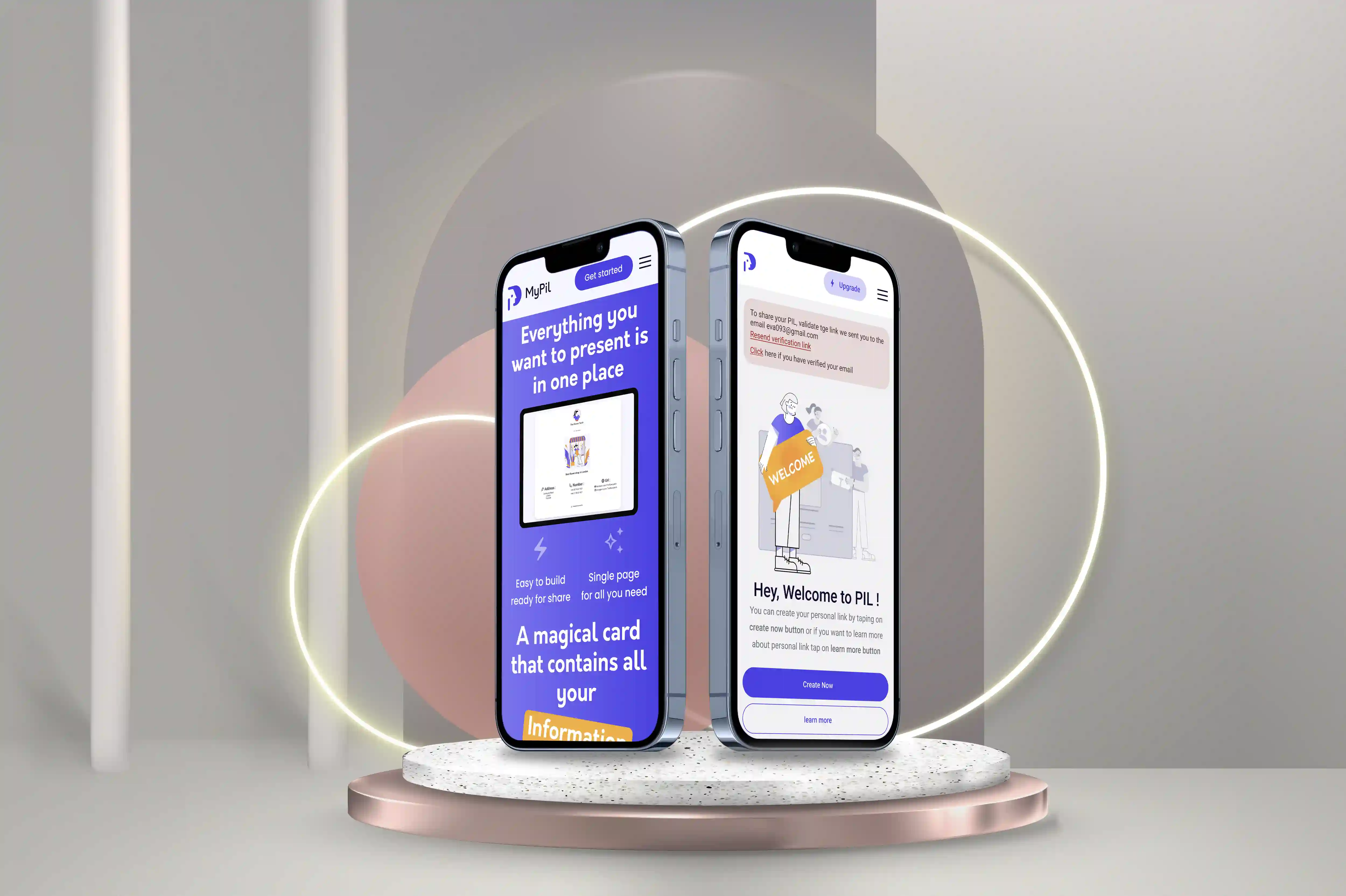
The problem:
1.Information Scattering
2. Ineffective Organization
3. Limitations in Sharing
4. Lack of Personalization
The goal:
The primary goal of the MyPIL service is to provide users with a centralized and efficient solution for managing their digital information. The service aims to streamline the process of storing, organizing, and accessing various types of information, such as website links, online store links, contact details, and more.
My role:
Product Designer and Branding at Pinkswan .
My responsibilities:
As a Product design, my role includes user research, UI design, prototyping, usability testing, and collaborating with illustrators for character design, logo creation, and producing various illustrations for the platform that align with our branding.
User research: Summary
In spearheading the user research for the MyPIL platform, I utilized an array of investigative approaches to deeply understand our target users’ needs and actions. This included the use of polls, interpersonal dialogues, experiential observations, practicality testing, gathering user feedback, and conducting comparative market evaluation. By implementing these meticulous research techniques, I acquired a profound understanding of our users, empowering me to design the MyPIL platform in a way that addresses their requirements efficiently.
User research: Pain points
In the course of my meticulous research for our platform, I arrived at several vital findings:
Resource Accessibility Constraints: Some users confronted limitations in accessing vital resources or functionalities, which impeded their experience and ability to take full advantage of the platform.
Usability Complexity: If the platform possesses a complex interface or lacks intuitiveness, users may struggle to use it effectively. A deficit of user guides, improper navigation, or performance deficiencies could result in difficulties utilizing the platform.
Insufficient User Support: A lack of user resources, such as clear documentation, instructional tutorials, or quick client service could make it challenging for users to resolve issues or get necessary assistance, affecting user satisfaction
Security Apprehensions: Users could be worried about the safeguarding of their private data or the security of transactions made on the platform. Perceived vulnerabilities may deteriorate users’ trust in the platform.
Absence of Personalization: The platform may lack specific features, customization options, or functionalities addressing individual user needs, causing dissatisfaction and limiting user-specific tailorability.
Device Compatibility Issues: If the platform is not optimized for various devices like mobile phones, tablets, or different operating systems, it could lead to accessibility or usability difficulties.
Persona
Name: David
Age: 32
Occupation: Freelance Designer
Background:
David is a freelance designer hailing from Los Angeles, CA. He holds a degree in Graphic Design from the prestigious California Institute of the Arts. Over the years, he’s worked with a range of clients and built a robust portfolio. He is tech-savvy, a keen learner, and places great emphasis on organization and efficiency. In his spare time, David enjoys photography, attending art exhibits, and absorbing the rhythm of live music.
Goals and Motivations:
1. Wants a convenient way to store and access all required information in one place.
2. As a self-employed professional, seeks the ability to share his digital card with his clients.
3. Is keen on personalizing his digital cards to reflect his personal brand and professional image.44
4. Wants to create multiple digital cards for different purposes (business, personal, etc.) if he purchases the premium version.
5. Always interested in analyzing his digital cards stats to track performance and gauge effectiveness.
6. Desires the connection feature to network with others and broaden his professional reach.
Pain Points:
1. Struggling to manage multiple information sources, he needs a unified platform.
2. Has concerns about his personal brand presentation, and thus needs extensive customization features.
3. Finds it difficult to measure his networking effectiveness without proper analysis tools.
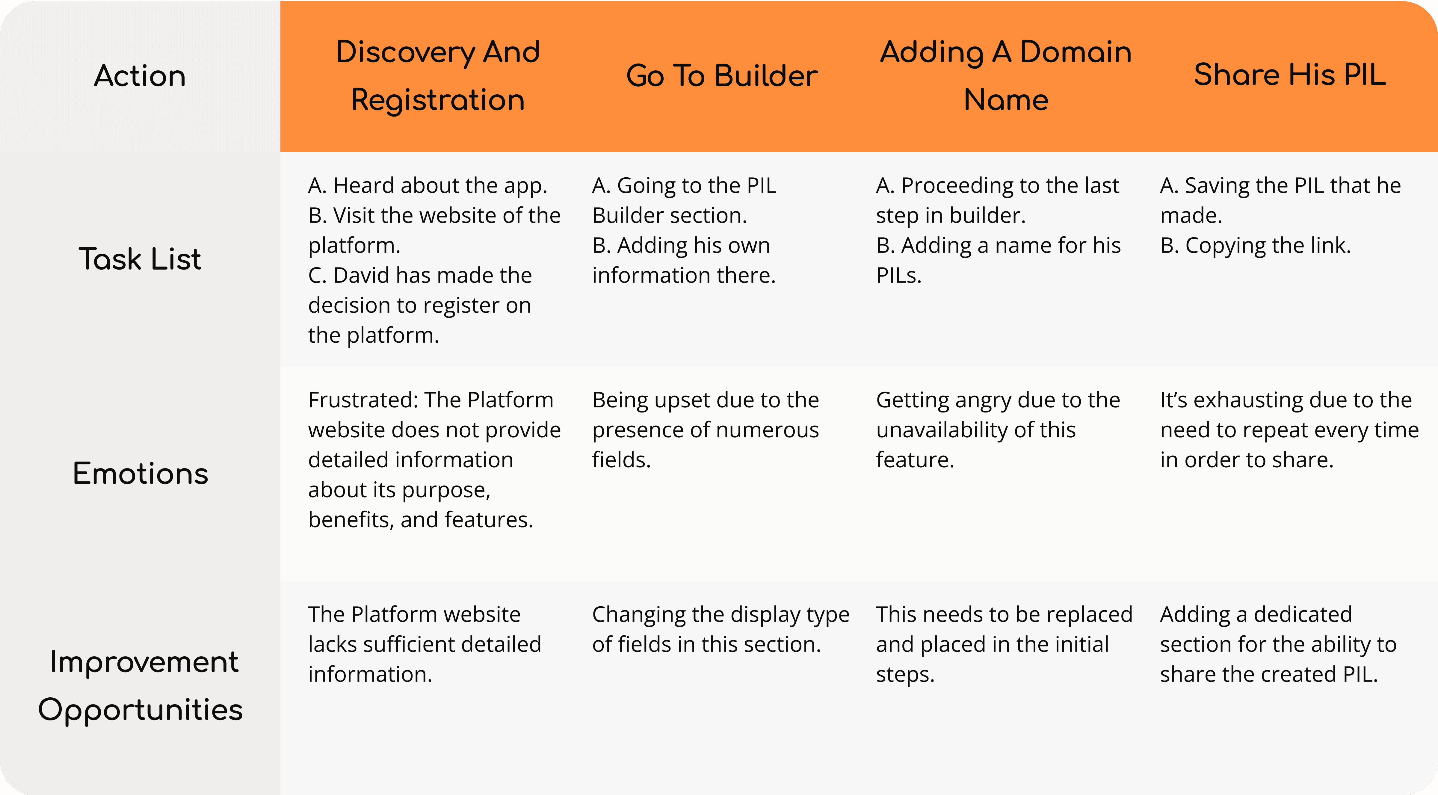
User journey map
Persona: David
Goal: David’s goal is to gather all of his links and information in one place, and be able to share that.
Branding
Logo :
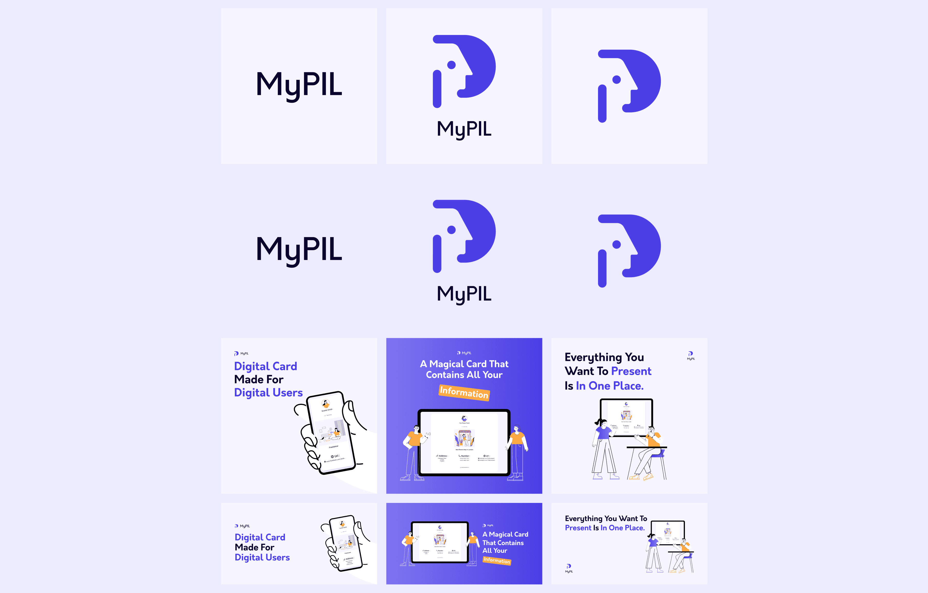
As a Product Designer, I collaborated with the Product Owner and a Graphic Designer to create our brand’s logo. After several meetings and reviewing a selection of potential designs, we collectively agreed on a concept. The Graphic Designer then sketched the logo, which, upon receiving our final approval, was digitally designed. This process ensured an effective and representative logo for our brand.
Color :
I have chosen purple as the primary color for this project, MyPIL. There are several reasons behind this choice:
1. Uniqueness: The color purple is less common in tech branding, helping MyPIL stand out from the sea of similar platforms.
2. Sign of Innovation: Purple symbolizes creativity and imagination, highlighting that MyPIL is an innovative platform offering unique solutions for users to link and manage their digital content.
3.Balanced Functionality: Being a blend of red and blue, purple embodies a perfect balance of dynamic functionality and stability, both of which are core features of MyPIL.
4. User Experience: The color purple, especially its softer shades, is known for its calming effects. This is indicative of MyPIL’s emphasis on creating a serene, user-friendly, and enjoyable experience for the users.
In sum, the color choice aligns with the values and aspirations of MyPIL, aiming to simultaneously set the brand apart, reflect its innovative character, assure functionality, and enhance user experience.
Font :
In designing MyPIL’s landing page, I’ve chosen Orkney and Poppins for their unique brand benefits and impact on product design. Orkney improves professionalism with its clean design, while Poppins adds a user-friendly touch. They enhance legibility and help create visual hierarchies, guiding user attention. Their regular use boosts brand recognition, and their versatility ensures design flexibility for future changes. They help establish a strong brand voice while making the interface user-friendly. In the design of the MyPIL app interface, I’ve chosen to use the Roboto font. This selection offers multiple benefits:
1. Brand Continuity: The modern and clean aesthetics of Roboto align well with the professional and user-friendly tone set by Orkney and Poppins on the landing page, maintaining a cohesive brand image across platforms.
2. High Readability: Roboto has been created for high legibility across all screen sizes. This makes the app straightforward to use, hence improving user experience.
3. Variety of Weights: Roboto comes with a variety of font weights, enabling clear hierarchy in design, emphasizing important information and creating ease of navigation for users.
4. Versatility: As a neo-grotesque sans-serif font, Roboto is versatile in a way that it fits seamlessly with various design elements, ensuring a harmonious look and feel throughout the app.
Illustrations and graphic elements :
I have requested the graphic designer to have the character designs in the desired style for the characters, which is simple, two-dimensional, and single-stroke., and I have mentioned the following reasons for choosing this style:
1. Distinctiveness: I believe that using a simple, two-dimensional style with single-stroke characters will make them easily distinguishable and recognizable.
2. Minimalistic Aesthetics: I appreciate the clean and uncomplicated design style, as it lends a modern and visually appealing look to the characters.
3. Versatility: I find that the simplicity of the character designs allows for their adaptability across different mediums and platforms, ensuring a consistent brand image.
4. Ease of Animation: I anticipate that the stroke-based design style will facilitate smooth and straightforward animation transitions, adding dynamic elements to my visuals.
5. Time and Resource Efficiency: I consider that creating and adjusting designs in this style will be less time-consuming and resource-intensive, making it a practical choice for my project.
By incorporating these design elements, I aim to achieve distinct, visually appealing, versatile, and efficient character designs that align with my branding and project goals.
Creating Engaging Covers for Google Ads :
I’ve crafted various covers for Google Ads, ensuring each is compelling, high-quality, and relevant. I use text wisely, maintaining brand consistency, and adhering to ad dimensions. All my covers meet Google’s ad policies to foster effective customer engagement.
Paper wireframes
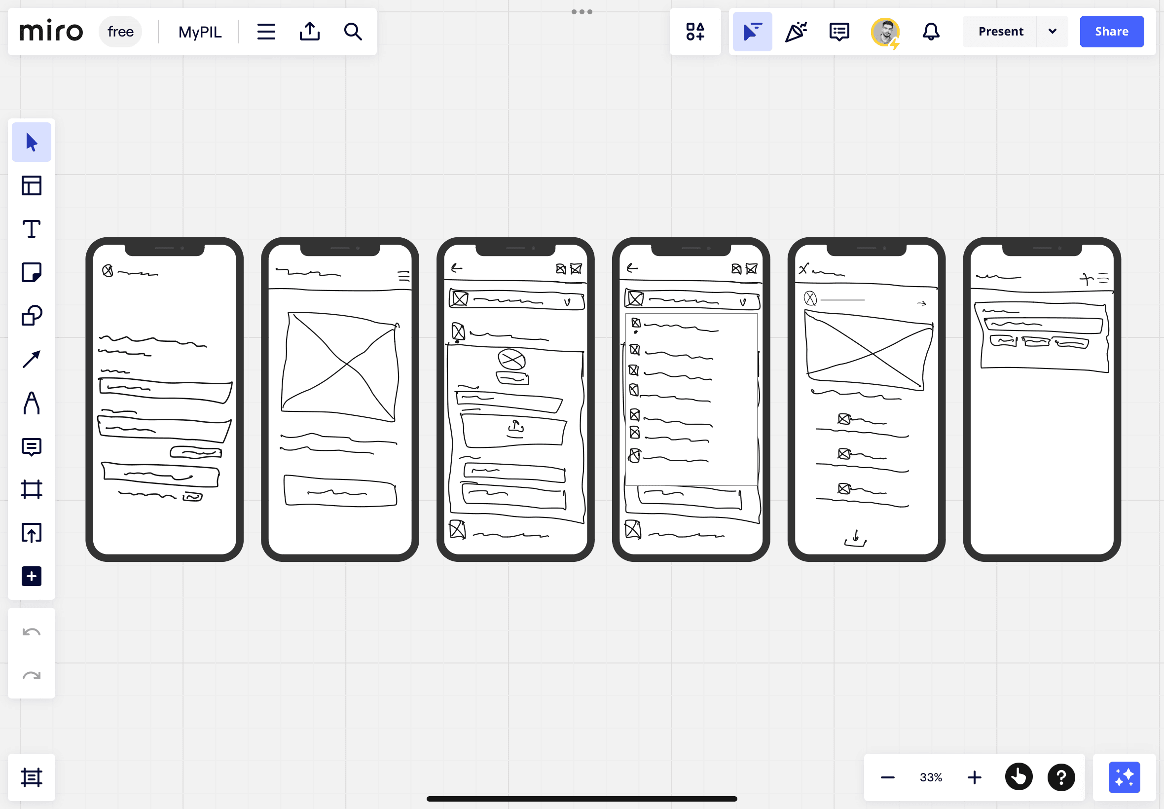
Once the data was collected, the next step was to create paper wireframes for various screens based on initial ideas. These wireframes were analyzed to determine which elements could be included in the digital wireframes and how they could address the pain points of the users.
Digital wireframes
As the initial design phase continued, I made sure to base screen designs on feedback and findings from user research.
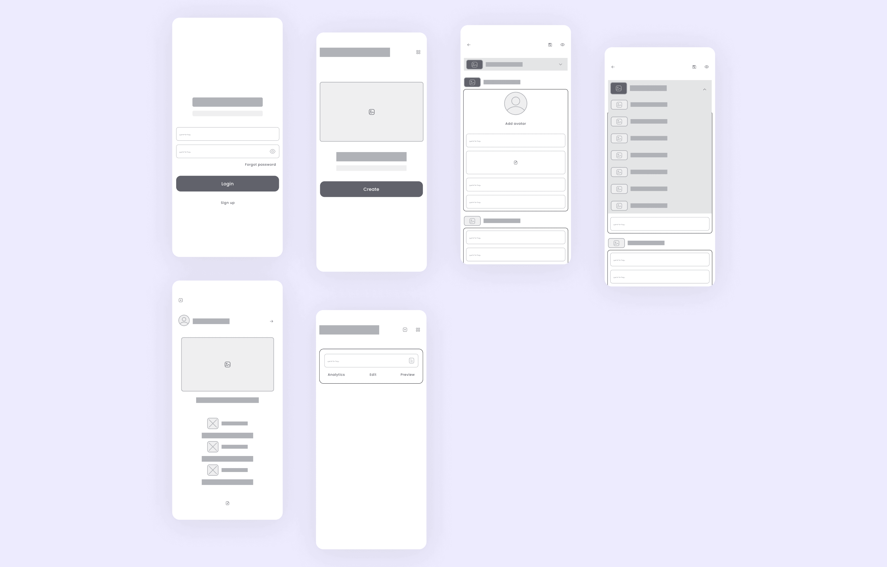
Low-fidelity prototype
The low-fidelity prototype demonstrated how the user worked with the platform to complete the first phase of the Rah-Neshan tournament.
Usability study: Findings
During the evaluation of the low-fidelity prototype, valuable observations and insights were gathered, incorporating feedback from a graphic designer, a product owner, a product manager, and several programmers in our company, each having diverse backgrounds and experience.
Users expressed a desire for the ability to access their account via Google or other platforms for a smoother and more convenient login experience. They appreciate the integration of third-party platforms for effortless user authentication and seamless navigation.
After logging into the platform, users have expressed a need for more detailed explanations. They emphasized the importance of clear, concise instructions to facilitate a deeper understanding of the platform’s functionalities, improving user experience and interaction.
On the digital card creation page, users encountered significant difficulties working with and completing the provided fields. They believe the current interface requires a complete revision, stressing the necessity for making it more user-friendly and intuitive to ensure efficient user interaction and satisfaction.
The user-generated cards on the dashboard lack extensive features. Users have indicated a need for more functionalities, such as the ability to deactivate their card. Additionally, they’d like the provision for displaying more information, like avatar pictures set on their digital cards, and the option to name these cards. Such enhancements would improve user control and personalization of the generally static digital cards.
The users have expressed their dissatisfaction with the display of their cards once created. They are not entirely satisfied with the presentation mode and request advanced personalization capabilities. They want to tailor-make their digital cards to better express their unique tastes, making individual cards more unique and user-oriented.
Mockups
I mentioned that for many users, the system was still confusing and they were perplexed. Most of them were unable to find the feature of embedding the code on their card.
Working with the application and builder is still confusing for users. There is a need for a guided tour.
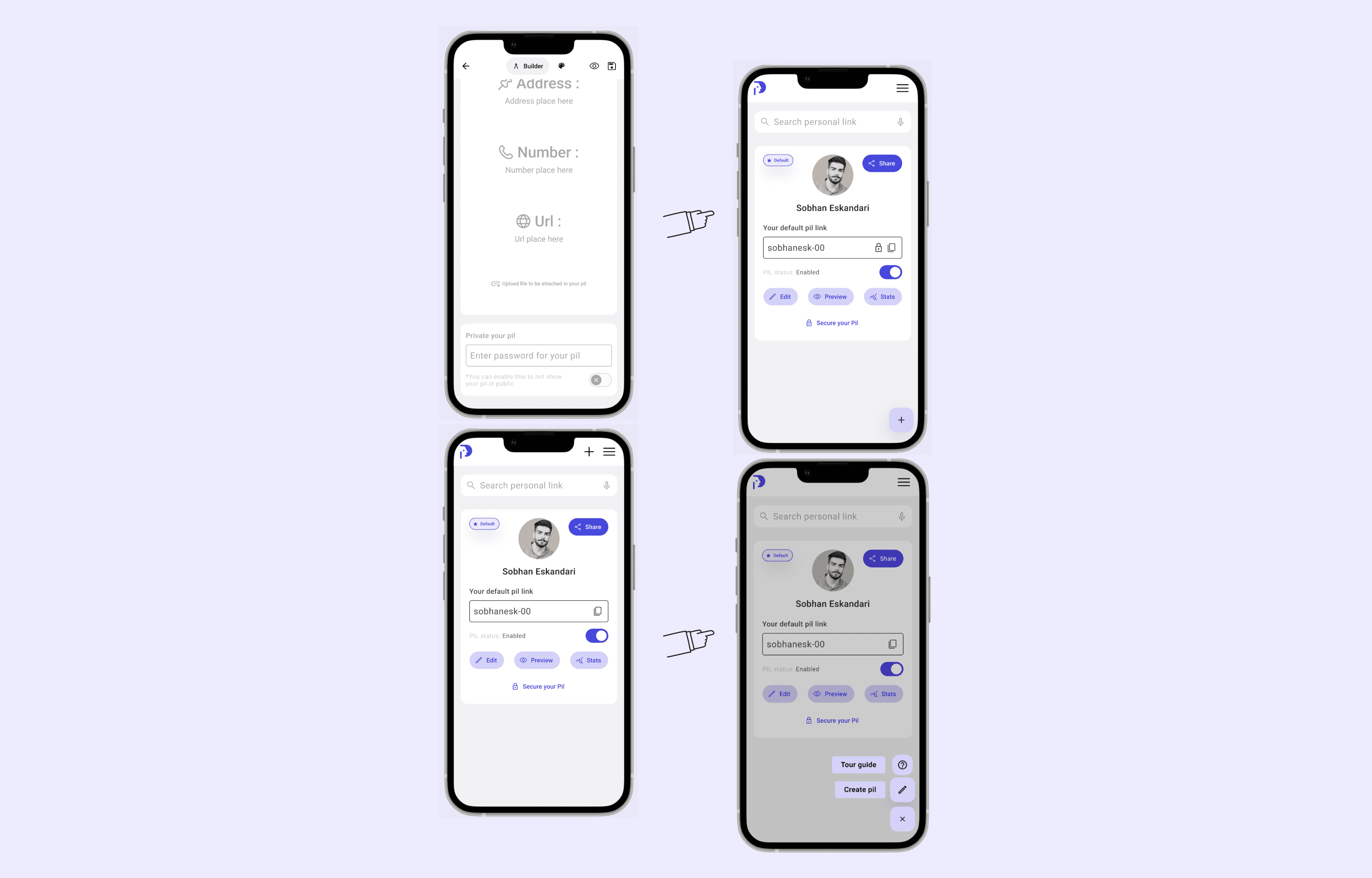
High-fidelity prototype
The final high-fidelity prototype presented users can easily log into their accounts and register more conveniently. They can effortlessly complete their profiles with ease. They can easily find the projects they desire and participate in them. They can choose priorities for their projects, submit them, and await the next stage.
Responsive website, High fidelity prototype
Final high-fi prototype for responsive website for desktop screen.
Other features
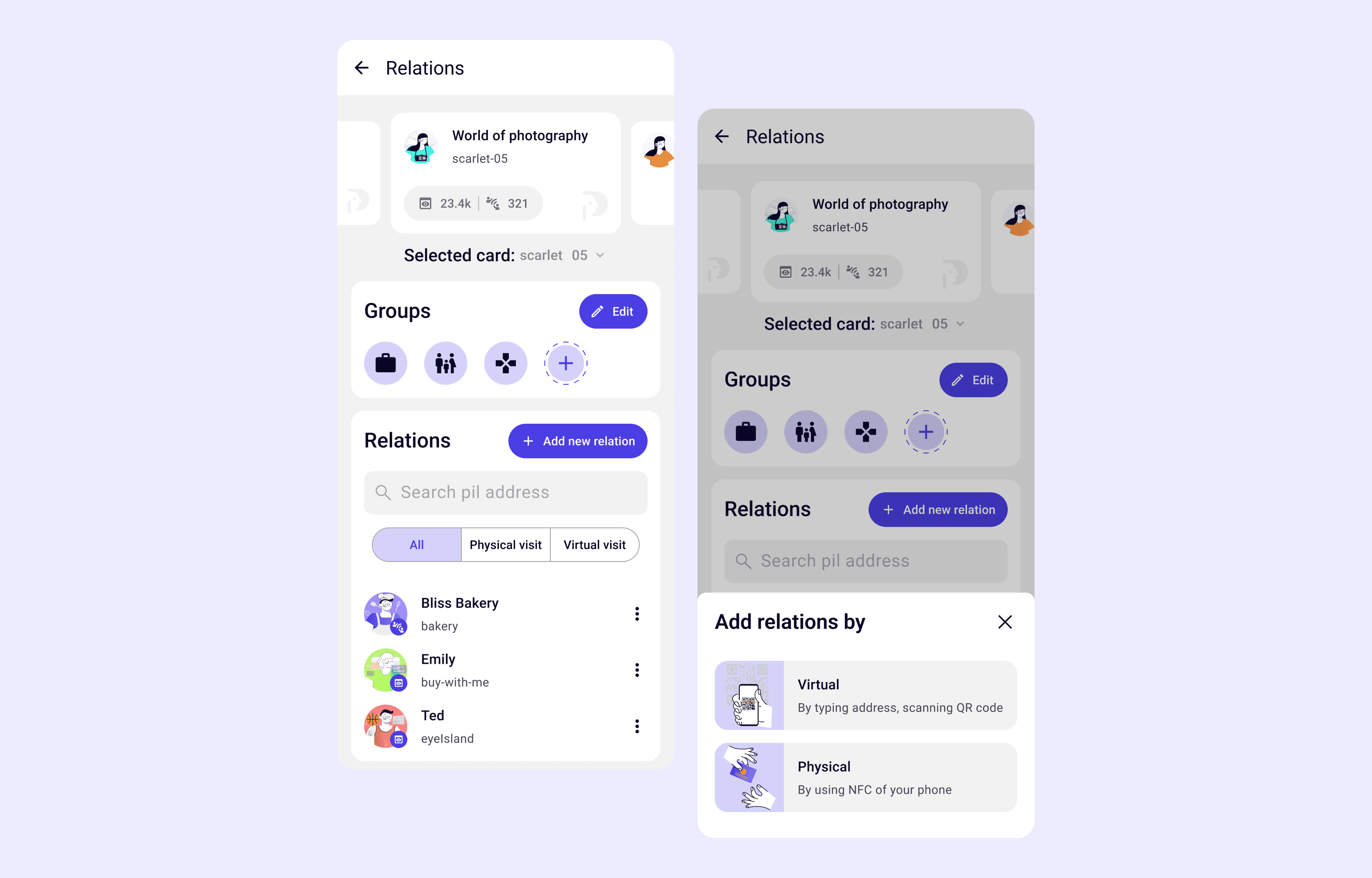
Relations :
I have added a "Relations" section to the program to meet users' need for communication and centralized management of digital cards. Here are the benefits:
1. Centralized Communication: Users can conveniently access all their digital cards and contacts in one place, streamlining communication.
2. Efficient Relation Management: The "Relations" section helps users keep track of interactions and important details, improving organization and management of relationships.
3. Improved Accessibility: Users can quickly find contact information, enhancing accessibility and reducing search time.
4. Enhanced User Experience: The "Relations" section provides a seamless solution for communication and contact management, enhancing the overall user experience.
Additionally, users can expand their network by adding more relations through NFC, scanning, or entering the link of another digital card. This feature allows for effortless incorporation of new contacts and further enhances relationship management within the program.
By designing the "Relations" section and incorporating the ability to add more relations, I have improved communication, streamlined relation management, enhanced accessibility, and provided a user-friendly experience in the program.
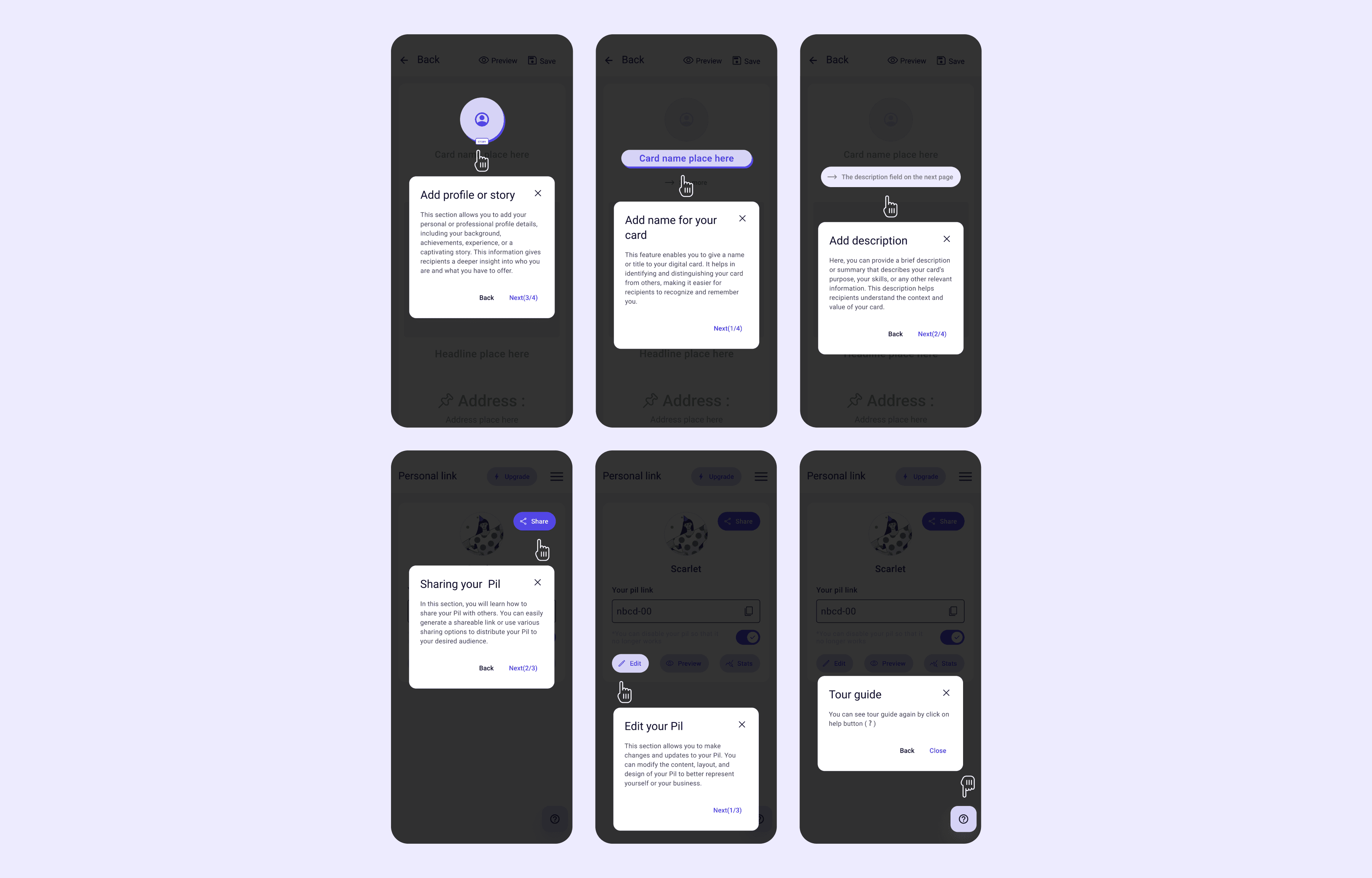
Tour guide :
I have incorporated user feedback and product owner suggestions into the program by adding a built-in tour guide and dashboard. This feature allows users who are unfamiliar with the program to receive step-by-step guidance by simply clicking on the "Tour Guide" button.
By implementing this feature, users can easily navigate through the program and understand its functionalities with the help of interactive tutorials and instructions provided in the tour guide. This ensures a smoother onboarding experience and helps users make the most out of the program.
Please note that the tour guide feature is designed to assist users who may be unfamiliar with the program's interface or functionalities. It aims to provide guidance and support for an intuitive and user-friendly experience.
Accessibility considerations
During the evaluation of the low-fidelity prototype, valuable observations and insights were gathered, incorporating feedback from a graphic designer, a product owner, a product manager, and several programmers in our company, each having diverse backgrounds and experience.
Search Functionality: Users can search within the dashboard by typing keywords or phrases. This allows for quick and efficient navigation and retrieval of specific information or content.
Voice Search: Additionally, I have included voice search functionality in the dashboard. Users can simply speak their search queries, and the system will process and provide relevant results based on their spoken input. This feature offers an alternative method of interaction for users who prefer or require voice commands.
Language Switching: Users have the ability to change the language of the app. By providing language options, users can customize their experience and access content in their preferred language, improving usability and inclusivity.
Impact
This project has the following impacts:
Enhanced accessibility for diverse user needs.
Improved user experience and satisfaction.
Efficient information retrieval and time-saving.
Multilingual support for effective communication.
Increased productivity and workflow efficiency.
In summary, the project positively impacts accessibility, user experience, information retrieval, multilingualism, and productivity.
What I learned
From this project, I have learned the following:
Importance of Accessibility: I have gained an understanding of the significance of incorporating accessibility features in design, such as search functionality and voice input, to cater to users with diverse needs and preferences.Improved user experience and satisfaction.
User-Centric Design: I have learned the value of prioritizing the user experience and implementing features that enhance usability, customization, and satisfaction within the dashboard.Multilingual support for effective communication.
Efficient Information Retrieval: Through the implementation of search functionality, I have learned how to enable users to quickly find specific information or content, improving efficiency and productivity.
Multilingual Support: I have recognized the importance of providing language options to accommodate users who prefer different languages, fostering effective communication and inclusivity.
Project Impact and Evaluation: I have gained insights into assessing the impact of a project by considering factors such as accessibility, user experience, information retrieval, multilingualism, and productivity.
Next steps
It is essential to initiate another series of usability studies to confirm the effectiveness of the introduced enhancements in resolving user difficulties. This process will offer crucial insights into the accomplishment of design adjustments and permit any vital modifications based on user responses. Moreover, improving and strengthening the application based on insights procured from Hi-fi usability tests and usability studies is paramount for achieving the best user experience and satisfaction. Also, executing additional user analysis can assist in detecting emerging user preferences and demands that should be addressed in subsequent design iterations.